|
Nearly, 2 years ago Justin Williard of 538 introduced the idea of the Morey Index;; a score for players shooting efficient shots. The Morey Index just looks at the number of 3's and FT's a player took. I had not heard of the Morey Index until Feb 25th 2017 when the Houston Rockets had a Morey Score of 100 (58 3pta - 42 FTA) against the Timberwolves. I decided to sit down and take a look at game logs for the past 10 seasons and see what kind of trends popped out for teamwide Morey Scores. *Note: I didn't want to figure out how to loop my script that scrapes data from NBA.com so I only went back 12 seasons. I was intrigued by some of the results of this study so I hope to come back to this post soon and either update or make a new that expands to include more seasons. 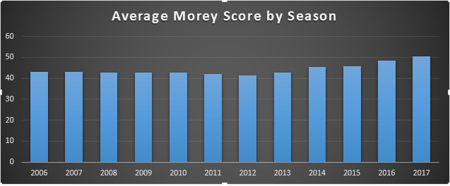 First things first. What exactly has the leaguewide trend been for overal Morey Index? If you're like me your immediate reaction upon seeing this chart was probably surprise, or disbelief. Afterall, we always hear about how the modern NBA offenses have been rapidly altering their style to become more efficient. You would think there would be a larger change over this period than what is seen in this chart, right? Consider two things. Morey Indext is a count of 3PA and FTA. The only real change we've heard about recently is the increase in 3PA. Hell, somewhere on this site I have a post discussing the increases in 3PA. However, this chart doesn't seem to reflect this drastic change. This can be attributed to the fact teams that aren't adept at true Morey Ball probably struggle to maintain their FTA while taking more and more shots further away from the rim. James Harden is a goddamn savant at Morey Ball so the Rockets can properly play the Morey Ball offense. 3 pointers and paint shots. The midrange might as well be lava because no one from Houston are taking shots there. The Rockets are somewhat of an outlier here. On the other end of the spectrum you have the Chicago Bulls... Yeah. The second consideration is that the bar chart somewhat lies to you. You don't see a huge change, when in fact there has been a 22.3% increase between this current season and the low point of my data series, 2012. Now that a leaguewide trend has been considered the obvious second question is, does Morey Index correlate to winning? The answer is a resounding, NO! 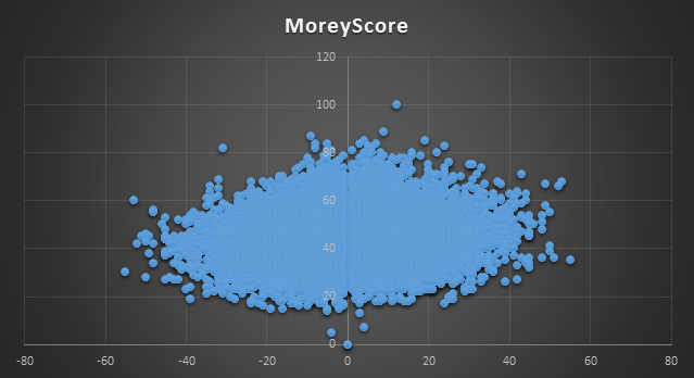 This chart shows a team's Morey Score on a game by game basis (Y axis) verse their margin of victory (X axis). It's rare to see a chart with >25,000 data points and you can easily count the number of significant outliers. Just one big bad blob! When I get around to updating this post I want to compare Morey Index for a season to Winning percentage. That would give a clearer picture if you can correlate MI to Wins. I don't have a chart for it but I did take a cursory look at the numbers and it didn't really seem like the two were in line. This is surprising to me and one of the things about this post that intrigued me the most. Finally, let's take a look at the way individual teams have trended with regards to their MI.
Anyway, like I said this project ended up intriguing me and I hope to update or write a followup to this post including more years and hashing out some new thoughts based on new ways of considering the data. Hope you enjoyed.
Comments
|
AuthorArchives
November 2017
Categories
All
|
 RSS Feed
