|
Steps towards visualizing NBA shooting data. In the past we talked about a Smart Shooting metric. Basically, it weighted a player's efficiency verse league average in a zone on the floor to their frequency of shot attempts in that zone to determine if a player is taking the "best" shot for their skillset. I was always disappointed with the relatively few zones that were provided via BBR. NBA.com has better options with several additional zones than BBR, but I wanted to take a more complete look. I split the court into a grid of 2.5ft x 2.5ft cells. With this gird, access to shot location data and some spatial analysis we can see shooting percentages for the league in a grid accross the floor. I haven't yet take the steps for calculating the smart shooting accross these zones, but I intend for this to be a several part series as I have a bunch of ideas that I'd like to attempt with this data. Step one get a grid and get all of the shots. I built my grid using ArcGIS. They have an easy to use tool called 'Create Fishnet' that allows you to create a grid. Next we need all of the shot data for the league. I only grabbed one season which amounted to 207,223 shots. It took some digging through stats.nba.com to find a comprehensive list of player ID's that I could use to loop through to get all of the shot data, and then I ran some code in R to build a file with all the data.. I could explain my code and how I accessed the NBA.com API but better documentation exists everywhere across the internet. Finally, its time to map the shots on the grid. 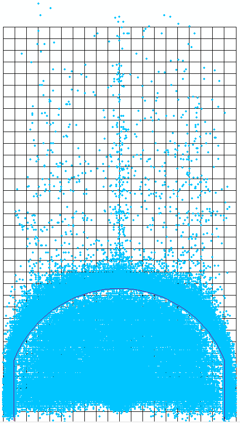 It always stands out to me how good players are at avoiding the extra long two. Obviously, the shot is still taken, but there is a clear outline just inside the arc. Pretty cool. Also, I like how "heave shots" seem to cluster dead on to the basket. Now, lets do a bit of spatial analysis to see the shooting percentages for the different grid cells. This can be done with a technique called Spatial Join. 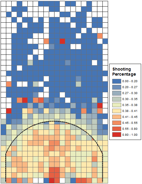 Pretty much what you'd expect I'd say. Higher percentage at the rim, lower percentage in the awkward long 2 zones. I was interested to see a pretty clear demarctation between the corner threes verse anwhere above the break on the arc. We hear all the time that the short corner 3's are the best 3's and this provides clear visual evidence. For now thats all the work I've done. I'll leave with some pandering to my audience. Here are the above charts but filtered to showing only Thunder data for last season. 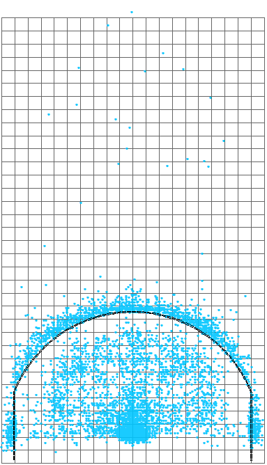 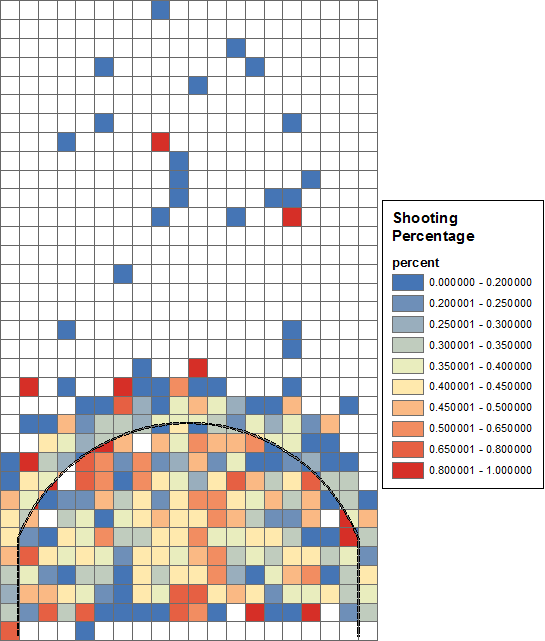
Comments
|
AuthorArchives
November 2017
Categories
All
|
 RSS Feed
